
Data science is a multidisciplinary field that combines math, statistics, computer science, machine learning, and domain expertise to extract insights from data. While data science algorithms often put the spotlight, a solid foundation in statistical methods can be just as pivotal.
The code in script is build on Python especially Python4Delphi as P4D.
1. Bayesian Inference
Bayesian inference uses Bayes’ theorem to update the probability of a hypothesis as more evidence or information becomes available.
Bayesian statistics offers a robust and flexible framework for understanding how beliefs should be updated in light of new evidence. This approach stands in contrast to classical statistics,
import pymc as pm
import numpy as np
//# Suppose we observed 20 coin flips with 12 heads and 8 tails
execstr('observ_heads = 12; observ_tails = 8');

execstr('with pm.Model() as model:  '+
          '# Prior for the bias of the coin (theta)                '+LF+
          'theta = pm.Beta(''theta'', alpha=1, beta=1)             '+LF+
          '# Likelihood                                            '+LF+
          'y= pm.Binomial(''y'',n=observ_heads+observ_tails,p=theta,observed=observ_heads)'+
          '# Posterior sampling                                    '+LF+
          'trace = pm.sample(200, tune=1000, cores=1, chains=2)   ');

execstr('pm.summary(trace)');
We perform Bayesian parameter estimation for a Bernoulli process (e.g., coin flips).
2. Hypothesis Testing (t-test)
Hypothesis testing involves formulating a null hypothesis (no difference/effect) and an alternative hypothesis. A t-test specifically checks if the means of two groups are significantly different.
execstr('from scipy.stats import norm');
execstr('from scipy.stats import ttest_ind')
     //# Synthetic data
execstr('group_A= np.random.normal(5,1,50); group_B= np.random.normal(5.5,1.2,50)');
execstr('stat, pvalue = ttest_ind(group_A, group_B)');

execstr('print(f"T-statistic: {stat:.2f}, p-value: {pvalue:.4f}")'+LF+
      'if pvalue < 0.05:                                                     '+LF+
      '    print("Reject the null hypothesis (Significant difference).")     '+LF+
      'else:                                                                 '+LF+
      '    print("Fail to reject null hypothesis (No significant difference).")');
A t test is a statistical test that is used to compare the means of two groups. It is often used in hypothesis testing to determine whether a process or treatment actually has an effect on the population of interest, or whether two groups are different from one another.
3. Factor Analysis (Loading Analysis)
Oh thats a real big topic in statistics. Factor Analysis models the observed variables as linear combinations of latent (unobserved) factors, often used for dimensionality reduction or to uncover hidden structure.
Factor Analysis is a statistical method used to describe variability among observed, correlated variables in terms of a potentially lower number of unobserved variables called factors1. This technique helps in reducing the number of variables by identifying a smaller number of underlying factors that explain the correlations among the observed variables2.
Key Principles
Factors: In factor analysis, a factor refers to an underlying, unobserved variable or latent construct that represents a common source of variation among a set of observed variables1. These observed variables are measurable and directly observed in a study.
Factor Loadings: Factor loadings represent the correlations between the observed variables and the underlying factors. They indicate the strength and direction of the relationship between each variable and each factor1.
//!pip install factor_analyzer
execstr('from factor_analyzer import FactorAnalyzer');
     //# Synthetic data (100 samples, 6 variables)
execstr('X = np.random.rand(100, 6)                              '+LF+
         'fa = FactorAnalyzer(n_factors=2, rotation=''varimax'')  '+LF+
         'fa.fit(X)                                               '+LF+
         'print("Loadings:\n", fa.loadings_)                       ');
Factor Analysis is a method for modeling observed variables, and their covariance structure, in terms of a smaller number of underlying unobservable (latent) “factors.” The factors typically are viewed as broad concepts or ideas that may describe an observed phenomenon. For example, a basic desire of obtaining a certain social level might explain most consumption behavior.
4. Cluster Analysis (K-means)
Clustering partitions data into homogeneous groups (clusters) based on similarity. K-means is a popular centroid-based clustering technique.
execstr('from sklearn.cluster import KMeans ');
     //# Synthetic data: 200 samples, 2D
execstr('X = np.random.rand(200, 2)');
execstr('kmeans = KMeans(n_clusters=3, random_state=42)');
execstr('kmeans.fit(X)');
execstr('print("Cluster centers:", kmeans.cluster_centers_)');
execstr('print("Cluster labels:", kmeans.labels_[:10])');
Cluster centers: [[0.48831729 0.1946909 ]
[0.20469491 0.71104817]
[0.74510634 0.71980305]]
Cluster labels: [1 1 2 0 2 0 0 2 1 1]
K-means cluster analysis is an iterative, unsupervised learning algorithm used to partition a dataset into a predefined number of clusters (k).
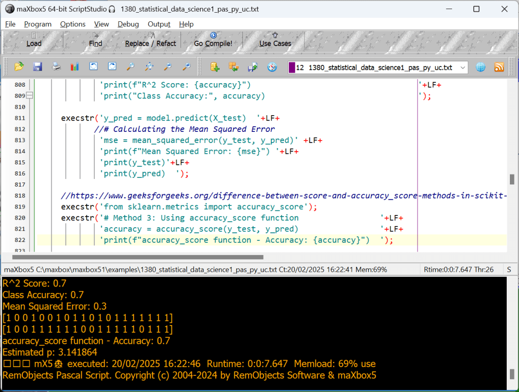
5. Logistic Regression Classifier
Logistic regression is used for binary classification, modeling the probability of a certain class or event existing.
execstr('from sklearn.linear_model import LogisticRegression');
execstr('from sklearn.linear_model import LinearRegression');
execstr('from sklearn.metrics import mean_squared_error');
execstr('from sklearn.model_selection import train_test_split');
execstr('np.random.seed(50)                                                '+LF+
         'X = np.random.rand(100, 5)                                        '+LF+
         'y = np.random.randint(0, 2, 100)  # Binary labels                 '+LF+
             'X_train,X_test,y_train,y_test=train_test_split(X,y,test_size=0.2) '+LF+
         'model = LogisticRegression()                                      '+LF+
         'model.fit(X_train, y_train)                                       '+LF+
         //# Predicting the target values for the test set
         //'y_pred = model.predict(X_test)                                   '+LF+
         '# Calculating the model score (R^2 score)                         '+LF+
         'accuracy = model.score(X_test, y_test)                            '+LF+
         'print(y_test)                                                     '+LF+
         'print(f"R^2 Score: {accuracy}")                                   '+LF+
         'print("Class Accuracy:", accuracy)                                ');

execstr('y_pred = model.predict(X_test)  '+LF+
        //# Calculating the Mean Squared Error
         'mse = mean_squared_error(y_test, y_pred)' +LF+
         'print(f"Mean Squared Error: {mse}") '+LF+
         'print(y_test)'+LF+
         'print(y_pred)  ');

//https://www.geeksforgeeks.org/difference-between-score-and-accuracy_score-methods-in-scikit-learn/
execstr('from sklearn.metrics import accuracy_score');
execstr('# Method 3: Using accuracy_score function                 '+LF+
         'accuracy = accuracy_score(y_test, y_pred)                 '+LF+
         'print(f"accuracy_score function - Accuracy: {accuracy}")  ');
[1 0 0 1 0 0 1 0 1 1 0 1 0 1 1 1 1 1 1 1]
R^2 Score: 0.7
Class Accuracy: 0.7
Mean Squared Error: 0.3
[1 0 0 1 0 0 1 0 1 1 0 1 0 1 1 1 1 1 1 1]
[1 0 0 1 1 1 1 1 1 0 0 1 1 1 1 1 0 1 1 1]
accuracy_score function – Accuracy: 0.7
This code snippet trains a linear regression model, predicts the target values for the
test set, and then calculates and prints the R² score and Mean Squared Error (MSE) for the model. Feel free to adapt it to your specific dataset and model!
Scikit-learns model.score(X,y) calculation works on co-efficient of determination i.e R^2 is a simple function that takes model.score= (X_test,y_test). It doesn’t require y_predicted value to be supplied externally to calculate the score for you, rather it calculates y_predicted internally and uses it in the calculations.
This is how it is done:
u = ((y_test – y_predicted) ** 2).sum()
v = ((y_test – y_test.mean()) ** 2).sum()
score = 1 – (u/v)
and you get the score !
[1 0 0 1 0 0 1 0 1 1 0 1 0 1 1 1 1 1 1 1] real
[1 0 0 1 1 1 1 1 1 0 0 1 1 1 1 1 0 1 1 1] predict
accuracy_score function – Accuracy: 0.7
We have 20 samples to compare (test_size=0.2 of 100) , we got 14 right predictions, that means 70 % of 20 samples (14/0.2=70) just so the score 0.7 aka 70 %!
6. Monte Carlo Simulation
Monte Carlo simulations use repeated random sampling to estimate the probability of different outcomes under uncertainty.
This interactive simulation estimates the value of the fundamental constant, pi (π), by drawing lots of random points to estimate the relative areas of a square and an inscribed circle.
execstr('np.random.seed(42)                                     '+LF+
        'n_samples = 10_000_00                                   '+LF+
        'xs = np.random.rand(n_samples)                          '+LF+
        'ys = np.random.rand(n_samples)                          '+LF+
        '# Points within the unit circle                         '+LF+
        'inside_circle = (xs**2 + ys**2) <= 1.0                  '+LF+
        'pi_estimate = inside_circle.sum() * 4 / n_samples       ');
execstr('print("Estimated π:", pi_estimate)');
Estimated p: 3.141864
7. Time Series Analysis (ARIMA)
ARIMA (AutoRegressive Integrated Moving Average) is a popular model for forecasting univariate time series data by capturing autocorrelation in the data.
In time series analysis used in statistics and econometrics, autoregressive integrated moving average (ARIMA) and seasonal ARIMA (SARIMA) models are generalizations of the autoregressive moving average (ARMA) model to non-stationary series and periodic variation, respectively. All these models are fitted to time series in order to better understand it and predict future values.

C:\maxbox\maxbox4\maxbox5>py -0
-V:3.12 * Python 3.12 (64-bit)
-V:3.11 Python 3.11 (64-bit)
-V:3.11-32 Python 3.11 (32-bit)
-V:3.10-32 Python 3.10 (32-bit)
-V:3.8 Python 3.8 (64-bit)
execstr('from statsmodels.tsa.arima.model import ARIMA ');
     //# Synthetic time series data
execstr('np.random.seed(42);  data = np.random.normal(100, 5, 50)');
execstr('time_series = pd.Series(data)');
     //# Fit ARIMA model (p=1, d=1, q=1)
execstr('model = ARIMA(time_series, order=(1,1,1))');
execstr('model_fit = model.fit()');
     //# Forecast next 5 points
execstr('forecast = model_fit.forecast(steps=5)');
execstr('print("Forecast:", forecast.values)');
Forecast: [98.26367322 98.50344679 98.51156834 98.51184343 98.51185274]
From understanding Bayesian inference and Cluster, through advanced concepts like Logistic Regression or LinearRegrison and ARIMA, these 7 advanced statistical approaches form a comprehensive and useful toolkit for any data scientist.
Most of the ideas has the source of: https://medium.com/@sarowar.saurav10/20-advanced-statistical-approaches-every-data-scientist-should-know-ccc70ae4df28


6 Nations Locs Ibertren-Jouef-HAG-Trix-Roco-Piko

5 Important Diagram Types
Here, I’ll show you how to analyze a runtime created dataset and extract meaningful insights with 4 diagram types:
- Bar Chart
- Scatter Plot
- Histogram
- Box Plot
- Correlation Matrix
For this project, we’ll create a dataset, clean it, filter out the data, and create meaningful visualizations with those 4 types.
http://www.softwareschule.ch/examples/pydemo91.htm
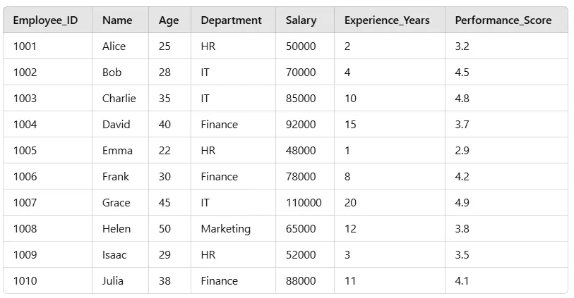
First, let’s import the necessary libraries and load our employee dataset:
# Import libraries
import pandas as pd
import numpy as np
import matplotlib.pyplot as plt
import seaborn as sns

# Create Employee Dataset
data = {
    'Employee_ID': range(1001, 1011),
    'Name': ['Alice','Bob','Charlie','David','Emma','Frank', 'Grace','Helen','Isaac','Julia'],
    'Age': [25, 28, 35, 40, 22, 30, 45, 50, 29, 38],
    'Department': ['HR','IT','IT','Finance','HR','Finance','IT', 'Marketing','HR','Finance'],
    'Salary': [50000, 70000, 85000, 92000, 48000, 78000, 110000, 65000, 52000, 88000],
    'Experience_Years': [2, 4, 10, 15, 1, 8, 20, 12, 3, 11],
    'Performance_Score': [3.2, 4.5, 4.8, 3.7, 2.9, 4.2, 4.9, 3.8, 3.5, 4.1]
}

# Convert to DataFrame
df = pd.DataFrame(data)

# Display first few rows
print(df.head())
This we can transpile in maXbox with Python for Delphi:
//# Create Employee Dataset
execstr('data = { '+LF+
        '"Employee_ID": range(1001, 1011), '+LF+
        '"Name":["Alice","Bob","Charlie","David","Emma","Max","Grace","Helen","Isaac","Julia"],'+LF+
        '"Age":[25, 28, 35, 40, 22, 30, 45, 50, 29, 38], '+LF+
        '"Department":["HR","IT","IT","Finance","HR","Finance","IT","Marketing","HR","Finance"],'+LF+
        '"Salary":[50000,70000,85000,92000,48000,78000,110000,65000,52000,88000],'+LF+
        '"Experience_Years":[2, 4, 10, 15, 1, 8, 20, 12, 3, 11],'+LF+
        '"Performance_Score":[3.2,4.5,4.8,3.7,2.9,4.2,4.9,3.8,3.5,4.1]'+LF+
        '} ');

//# Convert to DataFrame
execstr('df = pd.DataFrame(data)');

//# Display first few rows
execstr('print(df.head())');

//Data Cleaning    # Check for missing values
execstr('print(df.isnull().sum());  # Check data types print(df.dtypes)');

//# Convert categorical columns to category type
execstr('df[''Department''] = df[''Department''].astype(''category'')');

//# Add an Experience Level column
execstr('df[''Experience_Level''] = pd.cut(df[''Experience_Years''],'+LF+
               'bins=[0,5,10,20], labels=[''Junior'',''Mid'',''Senior''])');

//# Show the updated DataFrame
execstr('print(df.head())');

//Find Employees with High Salaries
execstr('high_salary_df = df[df[''Salary''] > 80000]');
execstr('print(high_salary_df)');
//Find Average Salary by Department
execstr('print(df.groupby(''Department'')[''Salary''].mean())');
//Find the Highest Performing Department
execstr('print(f"Highest Performing Department: {df.groupby("Department")["Performance_Score"].mean().idxmax()}")');
Now, we create meaningful visualizations using Matplotlib & Seaborn modules:
//Step 4: Data Visualization
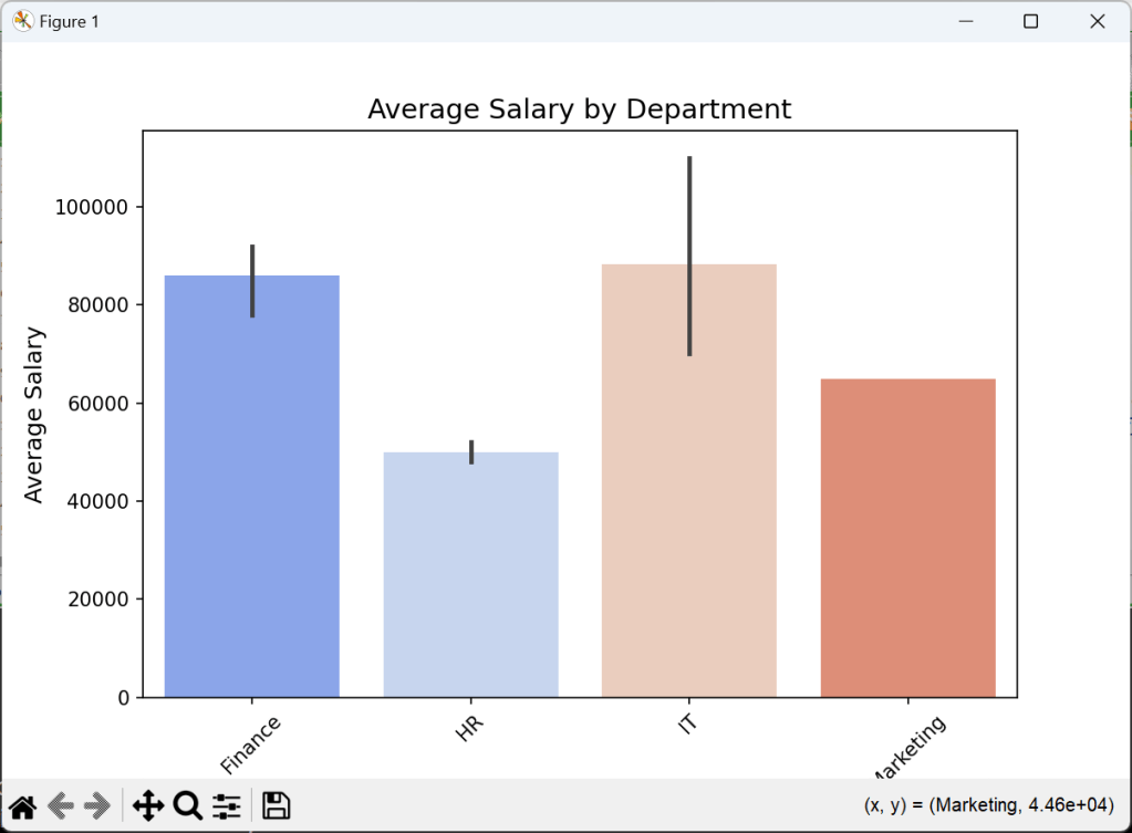
//📊 1. Bar Chart — Average Salary by Department
execstr('import matplotlib.pyplot as plt');
execstr('import seaborn as sns');
execstr('plt.figure(figsize=(8,5))'+LF+
'sns.barplot(x=df[''Department''],y=df[''Salary''],estimator=np.mean,palette="coolwarm")'+LF+
'plt.title(''Average Salary by Department'', fontsize=14) '+LF+
'plt.xlabel(''Department'', fontsize=12) '+LF+
'plt.ylabel(''Average Salary'', fontsize=12) '+LF+
'plt.xticks(rotation=45) '+LF+
'plt.show() ');
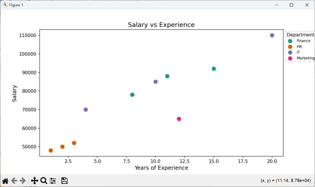
//📈 2. Scatter Plot — Salary vs Experience
execstr('plt.figure(figsize=(9,5))'+LF+
'sns.scatterplot(x=df["Experience_Years"],y=df["Salary"],hue=df["Department"],palette="Dark2",s=100)'+LF+
'plt.title(''Salary vs Experience'', fontsize=14) '+LF+
'plt.xlabel(''Years of Experience'', fontsize=12) '+LF+
'plt.ylabel(''Salary'', fontsize=12) '+LF+
'plt.legend(title="Department",bbox_to_anchor=(1, 1),fontsize=8) '+LF+
'plt.show() ');
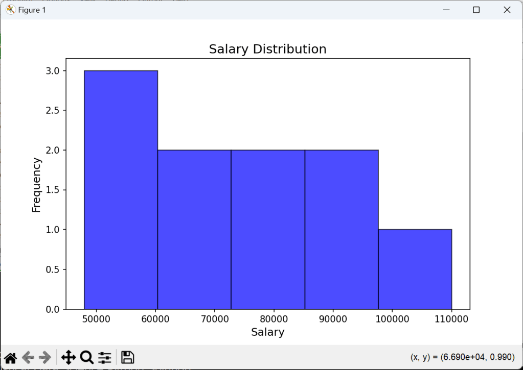
//📊 3. Histogram — Salary Distribution
execstr('plt.figure(figsize=(8,5)) '+LF+
'plt.hist(df["Salary"], bins=5, color="blue", alpha=0.7, edgecolor="black") '+LF+
'plt.title("Salary Distribution", fontsize=14) '+LF+
'plt.xlabel("Salary", fontsize=12) '+LF+
'plt.ylabel("Frequency", fontsize=12) '+LF+
'plt.show() ');
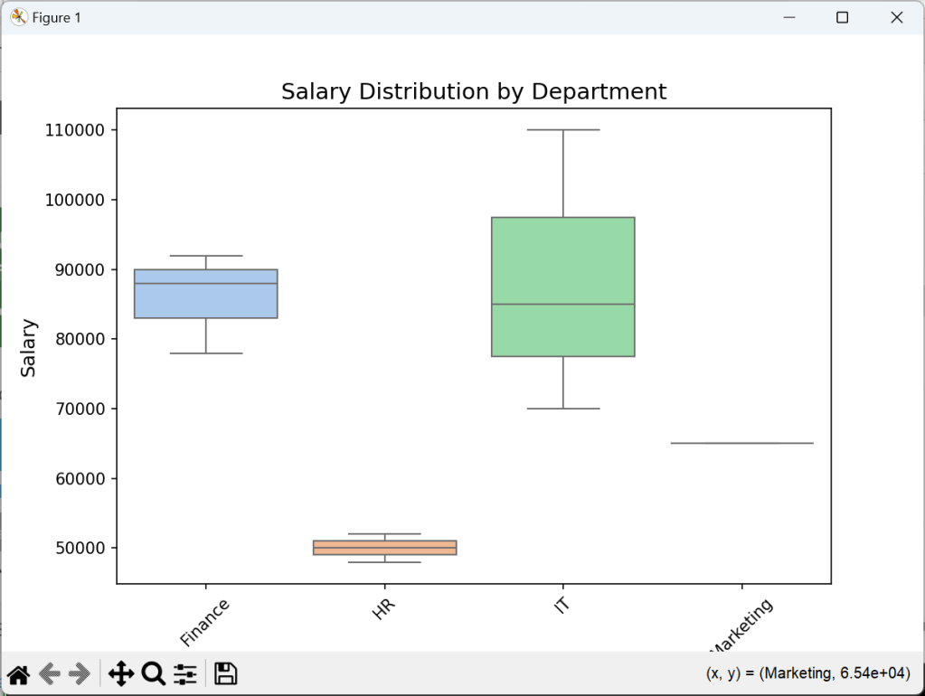
//📊 4. Box Plot — Salary by Department
execstr('plt.figure(figsize=(8,5)) '+LF+
'sns.boxplot(x=df["Department"], y=df["Salary"], palette="pastel") '+LF+
'plt.title("Salary Distribution by Department", fontsize=14) '+LF+
'plt.xlabel("Department", fontsize=12) '+LF+
'plt.ylabel("Salary", fontsize=12) '+LF+
'plt.xticks(rotation=45) '+LF+
'plt.show() ');
And the graphical result will be:
To go further, try working with larger datasets, dive into more advanced Pandas functions, or explore machine learning with Scikit-learn like above with statistical methods.
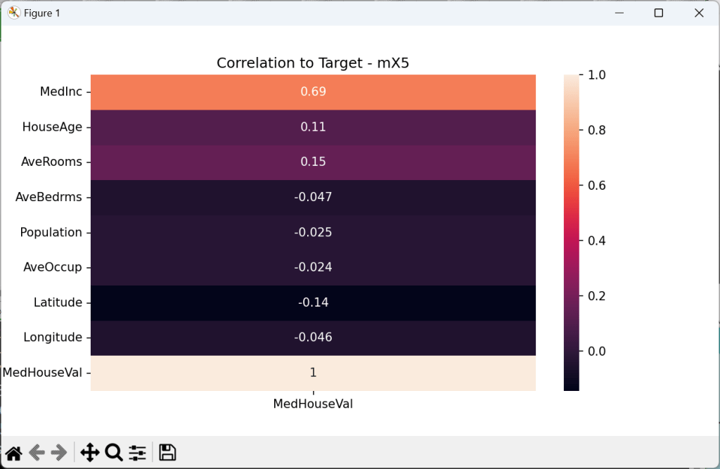
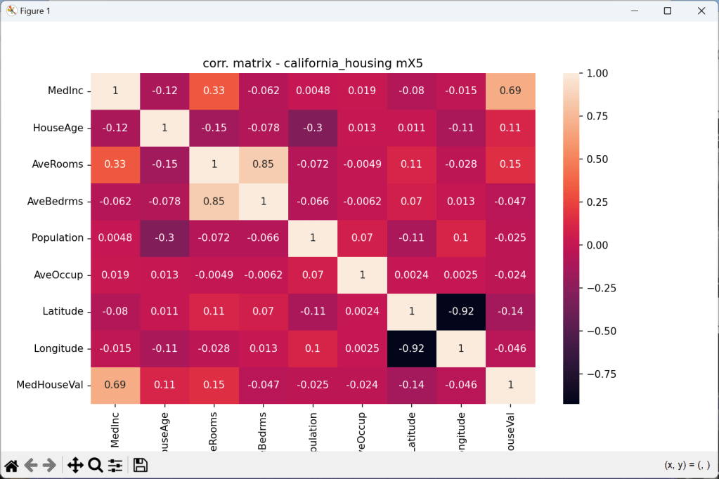
Correlation Matrix
Checking for correlation, and quantifying correlation is one of the key steps during
exploratory data analysis and forming hypotheses.
 //Start with Tutor 140
//# Target column is under ch.target, the rest is under ch.data
execstr('ch = fetch_california_housing(as_frame=True)');
execstr('df = pd.DataFrame(data=ch.data, columns=ch.feature_names)');
execstr('df["MedHouseVal"] = ch.target; print(df.head())');

execstr('fig, ax = plt.subplots(figsize=(10, 6))             '+LF+
        'plt.title("corr. matrix - california_housing mX5")  '+LF+
        'sns.heatmap(df.corr(),ax=ax,annot=True); plt.show() ');
Several types of visualizations are commonly used in EDA using Python, including:
- Bar charts: Used to show comparisons between different categories.
- Line charts: Used to show trends over time or across different categories.
- Pie charts: Used to show proportions or percentages of different categories.
- Histograms: Used to show the distribution of a single variable.
- Heatmaps: Used to show the correlation between different variables.
- Scatter plots: Used to show the relationship between two continuous variables.
- Box plots: Used to show the distribution of a variable and identify outliers.
- Correlation Matrix shows relations to each other variable


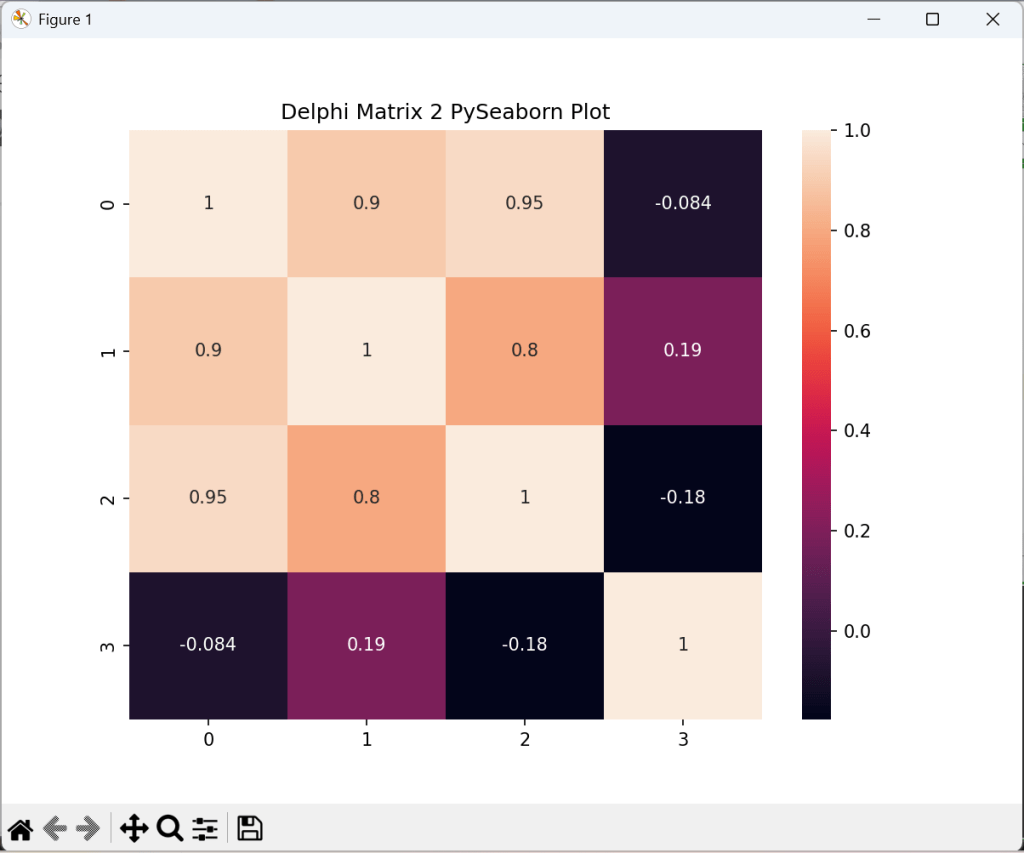
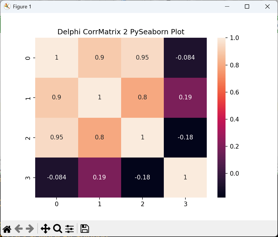
Import Delphi Double Arrays to Python Numpy Arrays and show Correlation Matrix
First we have to create data features:
type DMatrix = array of array of double;

procedure TForm1DataCreate(Sender: TObject);
var i,j,tz: integer;
  //mData: dMatrix; //array of array of Double;
begin
  // Example reference data as 4 features with 7 samples
  SetMatrixLength(mData, 4, 7);
  SetMatrixLength(corrMatrix, 4, 4);
  mData[0]:= [1.0, 2.0, 3.0, 4.0, 5.0,6.0,7.0];
  mData[1]:= [22.5, 32.0, 42.0, 52.0,55.7,50.1,55.5];
  mData[2]:= [15.0, 16.0, 17.0, 19.0,28.9,30.0,32.4];
  mData[3]:= [25.0, 126.0, 127.0, 119.0,118.9,120.8,12.7];
  writeln('Test Matrix Data TM: '+flots(mdata[2][3]));
  CalculateCorrelationMatrix2(mdata, corrMatrix);
A heatmap in seaborn requires 2D input. Use data = np.asarray([b]) in this case. Then we convert those array into a numpy array and reshape it for a panda dataframe:
//4. Matplotlib & Seaborn Correlation Matrix
  execstr('import matplotlib.pyplot as plt; import seaborn as sns');

  it:= 0;
  execstr('arr2 = np.empty(28, dtype = float)');
  for x:= 0 to 6 do
     for y:= 0 to 3 do begin
       execstr('arr2['+itoa(it)+']= '+flots(mdata[y][x]));
       inc(it)
     end;
  execstr('data2 = np.asarray(arr2).reshape(7,4)'+LF+
          'df = pd.DataFrame(data2)');
  execstr('fig, ax = plt.subplots(figsize=(8, 6))'+LF+
          'plt.title("Delphi Matrix 2 PySeaborn Plot")'+LF+
          'sns.heatmap(df.corr(), ax=ax,annot=True); plt.show()');
          //}
As the plot in seaborn has the right shape (7,4) we compute the correlation matrix:


Symbolic Regression with Genetic Programming
It uses genetic programming, which evolves models over generations through mutation and crossover (similar to natural selection).
# !pip install gplearn

import numpy as np
import matplotlib.pyplot as plt
from gplearn.genetic import SymbolicRegressor

# Generate Sample Data
X = np.linspace(-10, 10, 100).reshape(-1, 1)
y = 3*np.sin(X).ravel() + 2*X.ravel()**2 - 4

# Initialize the Symbolic Regressor
sr = SymbolicRegressor(population_size=2000,
                       generations=20,
                       stopping_criteria=0.01,
                       function_set=('add','sub','mul','div', 'sin','cos','sqrt','log'),
                       p_crossover=0.7,
                       random_state=42)

# Fit the model
sr.fit(X, y)

# Make Predictions
y_pred = sr.predict(X)
# plot
plt.scatter(X, y, color='black', label='True Data')
plt.plot(X, y_pred, color='red', label='Discovered Function')
plt.legend()
plt.show()


Classification after Factor Analysis:
One approach that side-steps cross-validation to determine the optimal number of factors is to use the nonparametric Bayesian approaches for factor analysis. These approaches let the number of factors to be unbounded and eventually decided by the data. See this paper that uses such an approach for classification based on factor analysis.
LikeLike